Creating an Animated Time Series Map of the US Housing Price Index
Jordan Frey
February 5, 2019
LOAD PACKAGES:
library(tidyverse)
library(gganimate)
library(ggmap)
library(transformr)
library(RColorBrewer)
READ IN DATA:
state_hpi <- read_csv("https://raw.githubusercontent.com/rfordatascience/tidytuesday/master/data/2019/2019-02-05/state_hpi.csv")
usa <- as_tibble(map_data("state"))
READY HPI DATA FOR VISUALIZATION:
#summarize hpi by year and state, and find mean hpi for subsequent records
summarized_hpi <- state_hpi %>%
  group_by(year, state) %>%
  summarise(mean_price_index = mean(price_index))
READY MAP DATA FOR JOIN:
#give usa$region titlecase
usa$region <- str_to_title(usa$region)

#rename "region" column to "state"
usa <- usa %>%
  rename(state = region)

#create states tibble
states <- tibble(state.name, state.abb)

# add full state name to usa table
usa <- usa %>%
  inner_join(states, by = c("state" = "state.name"))
JOIN DATASETS
hpi_joined <- full_join(summarized_hpi, usa,
                         by = c("state" = "state.abb")) %>%
  filter(!is.na(year), !is.na(lat), !is.na(long))
CREATE ANIMATION WITH GGPLOT
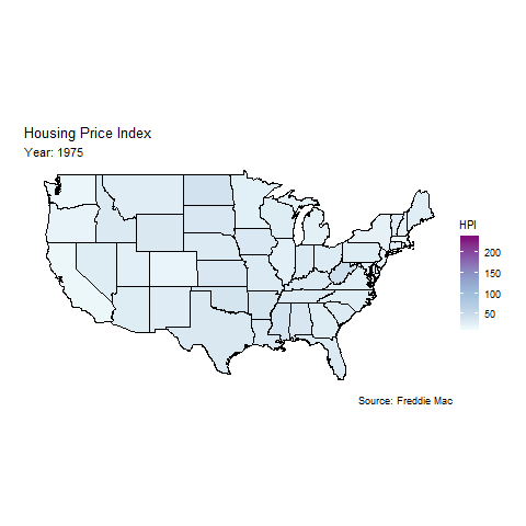
hpi_animate <- hpi_joined %>%
  ggplot(aes(long, lat, group = group, fill = mean_price_index))+
  geom_polygon(color = "black")+
  coord_map()+
  labs(title = "Housing Price Index",
       subtitle = "Year: {round(frame_time)}",
       caption = "Source: Freddie Mac")+
  theme_void()+
  theme(plot.margin = margin(2, .8, 2, .8, "cm"))+
  scale_fill_distiller(name = "HPI", palette = "BuPu", direction = 1)+
  transition_time(year)

animate(hpi_animate)
SAVE PLOT AS GIF
anim_save(filename = "data/hpi_animate.gif")